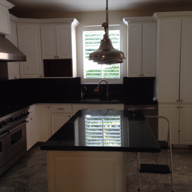
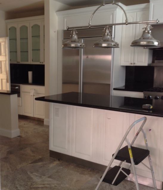
Before Our Renovation
For many years, we maintained a part-time home in South Beach allowing us to pop down for long weekends and occasional weeks in and out of season. Our place was right in the thick of things – a modern Bauhaus-inspired, all glass condo just off Lincoln Road. It was a great diversion and a perfect counter-balance to our more suburban existence in Northern Virginia. Along the way, we fell in love with the architecture, history, culture, as well as the diverse collection of ethnicities that make this Island their home. In our view, Miami Beach is the best current example of the American “melting pot”. As a result, we started to think about a larger home that would accommodate family and friends, while still maintaining close proximity to the South Beach action.
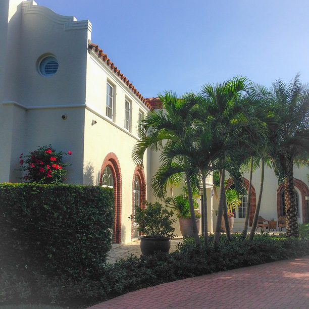
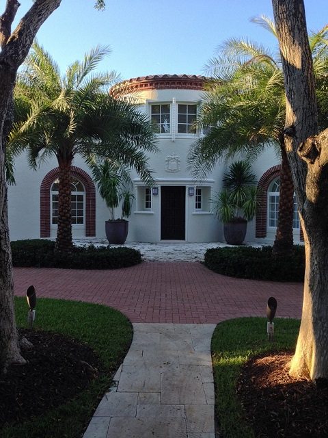
Architectural interest was also an important criteria in our search. Miami Beach is well known for its Art Deco style as well as MiMo (Miami Modern) and Streamline Moderne. However, the city’s original architectural roots pre-dated all of these genres and were initially inspired by homes of the Mediterranean. The house we selected was built in 1934 by one of the leading architects of the day, Carlos Schoeppl, who also designed the very first Art Deco building in Miami Beach (the La Salle automobile dealership on Lincoln Road). The style of the house is considered “Med-Deco” style, meaning a blend of Mediterranean Revival and Art Deco. As Miami Beach was designed in the early 20th century essentially as a theme park for the wealthy (the first radio station carried the call letters WIOD – “Wonderful Isle of Dreams”), the architecture was all about fantasy and oftentimes a home would include design elements from a variety of genres.
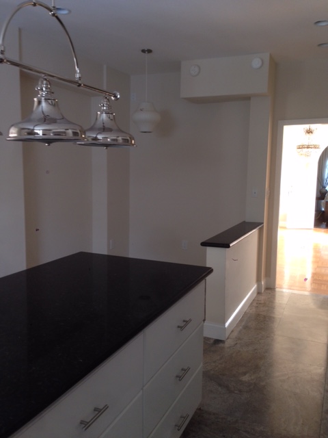
When we purchased the home, we knew the kitchen needed to be entirely renovated. The floor plan of the main house hadn’t been altered in any meaningful way since it was built as a winter retreat for a Texas family. While the Kitchen was updated in the 1990s, it was outdated, appliances were breaking down, and the connection between the kitchen and the rest of the house was stuck in the past. As we approached the project, we didn’t want to diminish the things we love about the home, but gently bringing the house into the modern era was essential.
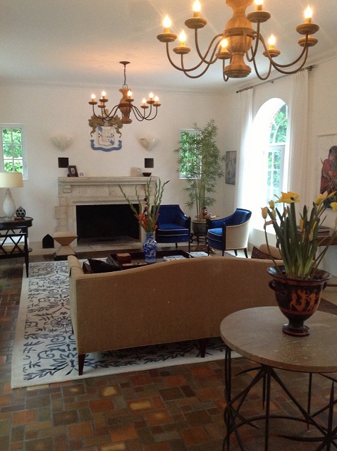
The floor plan revealed how different life was in the 1930s. The kitchen was originally the domain of the staff. As such, it is somewhat isolated from the rest of the first floor and has only one small window. As a result, the space is dark and not very “Florida”. Beyond the kitchen is a back hall that leads to two very small bedrooms and tiny full bath that once was used to house staff. A Butler’s Pantry provided a buffer between the Kitchen and Dining Room, thereby shielding the original owners from the mechanics and mess of the Kitchen. An adjacent sun porch had been converted to a modest interior family room several decades ago.
Needless to say, our lifestyle required changes to the design. We enjoy cooking, don’t have full time staff, and wanted the kitchen and adjacent spaces to better relate to each other. We also desperately wanted the kitchen to fully embrace the outdoors and natural light.
Our challenge is to create a new space that remains true to the Wonderful Isle of Dreams – a fantasy-inspired collection of materials that work together harmoniously.
Demolition & Construction Begins
After a thorough search process, we selected Cutting Edge Innovative as our general contractor.
They’re off to a great start!
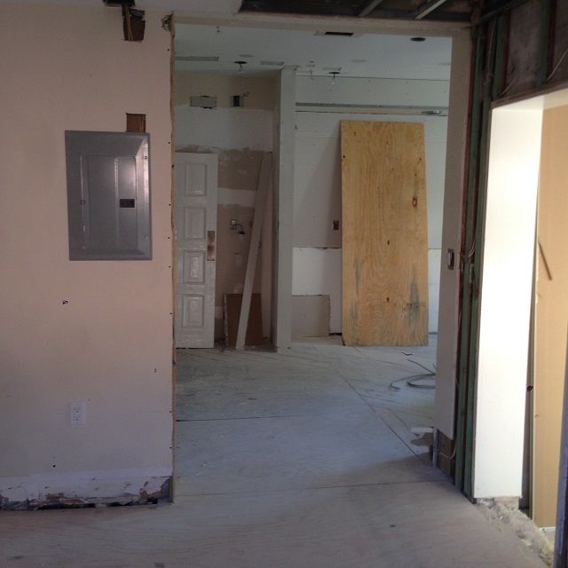
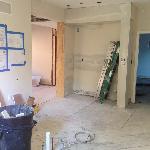
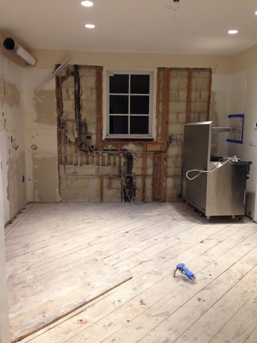
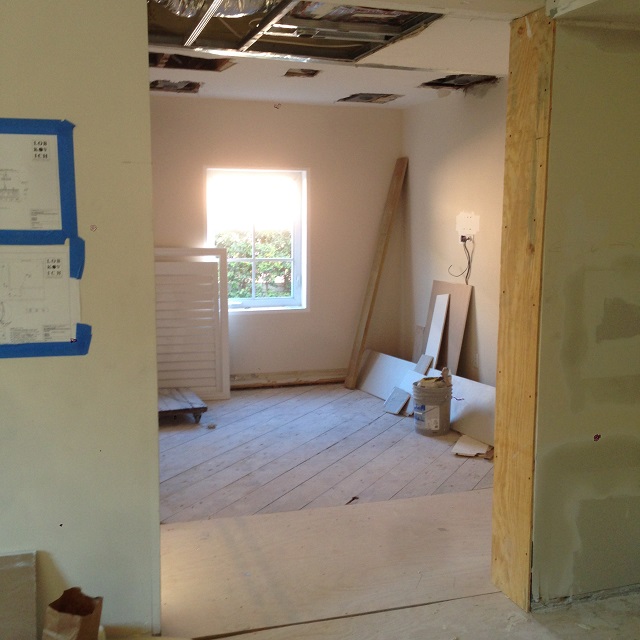
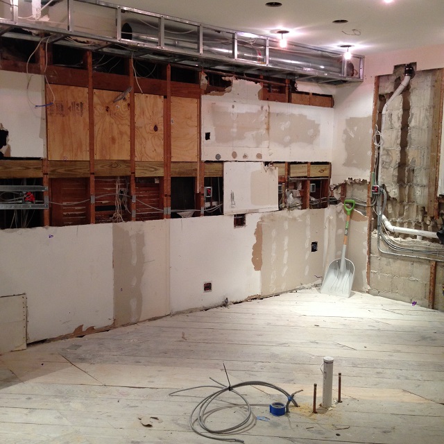
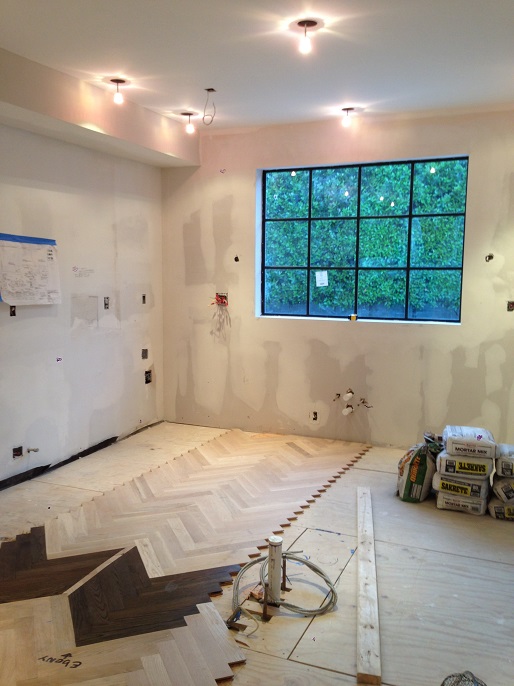
Everything has been demoed and removed, down to the original sub floor. The 20 year old built-in refrigerator we spent $3,000 to keep “alive” since we bought the house, has finally been retired…as have all other appliances, cabinets and countertops. The wall between the Kitchen and back hall has been opened, along with the wall to the old bedroom, providing a view through to the new Breakfast Room (behind the blue tape). The Kitchen will feel larger, more functional, and the total space will reflect a modern lifestyle.
The sub-floor will need some additional work before we can proceed. While much of it is in very good shape, some patching of the wood as well as concrete repair at the thresholds will be necessary. Also, a new layer of plywood in needed to insure a level base for the new wood floors. Demo has also revealed that the plumbing at the sink will need to be moved lower to accommodate the larger (taller and wider) window. No other surprises yet.
We can now see the original construction of the house up close. It was well built…and no ghosts so far!
The Glass (or plate) is Half Full
Living without a Kitchen isn’t easy, but it is a perfect opportunity to try out some new restaurants and spend some time in your old favorites. Miami Beach offers a huge range of options that change more frequently than the Kardashian’s wardrobe (or spouses).
We’re often asked for restaurant and bar recommendations. Here are some of our “go to” spots:
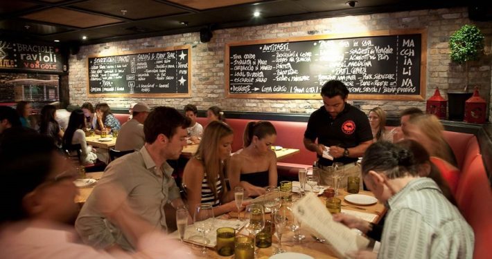
Macchiallina
Some of the very best Italian food in South Beach! Chef Michael Pirolo and his partner Jennifer Chaefsky deliver amazing hand-made pasta along with the most creative fish selections we’ve ever enjoyed. Their casual “East Village” vibe attracts an extremely loyal following of locals and excellent press. Look for their new location coming soon in Asheville, North Carolina. Great people, awesome food and wine.
Juvia
This will never make the “cheap eats” list, but the food is creative and the setting is the best on the Beach, high atop Lincoln Road with a panoramic view of all of Miami Beach. We like this best at lunch when they offer a “box lunch” menu that is both excellent and reasonably priced (and the view is most amazing by day). If you’re trying to impress a date or your parents are in town, you’ll especially appreciate this spot. I could eat their Salmon Nashi all day long!
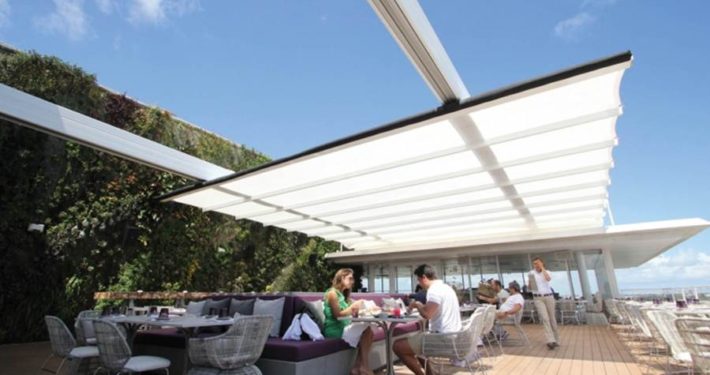
27 Restaurant
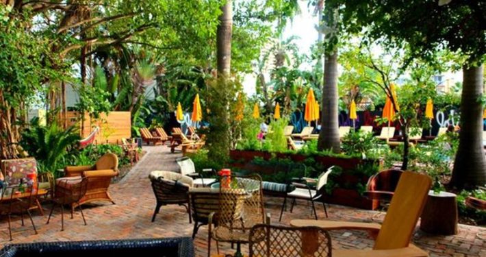
A new entrant on the scene, located in the Freehand Hostel just north of South Beach. This grew out of the massive success of The Broken Shaker Bar next door – recently rated one of the Top 50 Bars in the WORLD (yes, the world)! The restaurant offers great food, reasonable prices and attracts a cool crowd. Try both. We love this pair.
Blackbrick
If you’re willing to venture a few minutes by car across Biscayne Bay, check out Blackbrick, which Bon Appetit Magazine recently named one of America’s 50 best new restaurants. Modern Chinese is their thing – and their dim sum menu is outrageously good. We never know when to stop ordering here and we never leave without cleaning every plate. Yum!!!

New Materials
Starting to finalize decisions on what will go into the new space. Something old, something new.
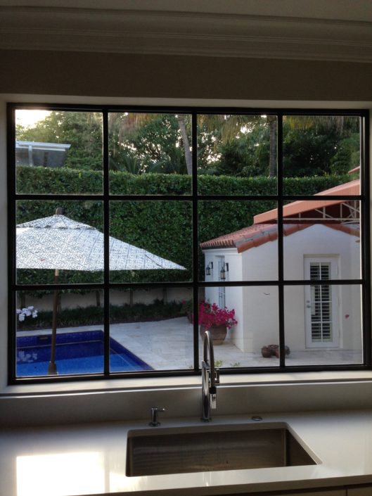
The new window is in! As expected, this makes a huge difference in the space. The light is amazing and we can now enjoy a full view to the yard, pool, cabana and outdoor kitchen. We elected to do a bronze frame on the inside to work with the flooring and other elements described below.
For floors, we selected a classic herringbone pattern in a Quarter-sawn White Oak. New flooring will encompass the Kitchen, Dining Room, Breakfast Room, Family Room, back hall, Guest Bedroom and Powder Room. This material is extremely durable and the grain is linear. With a warm, dark brown stain (we chose Jacobean), this will be a perfect base for the other materials to rest upon.
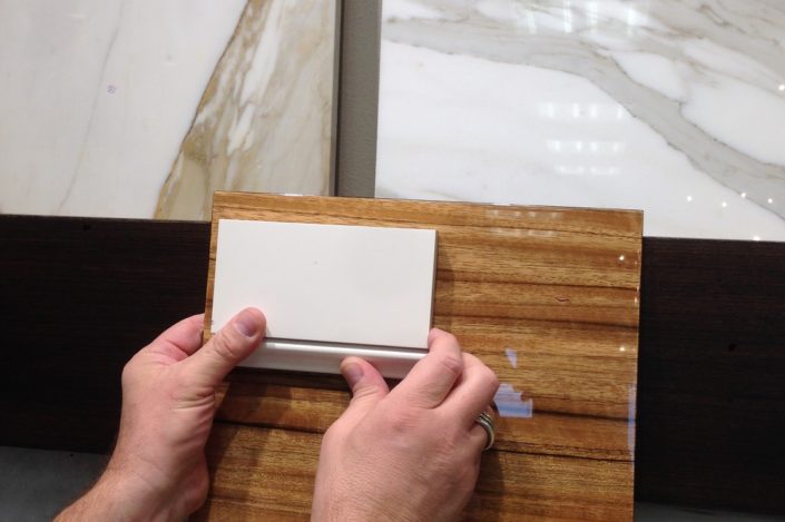
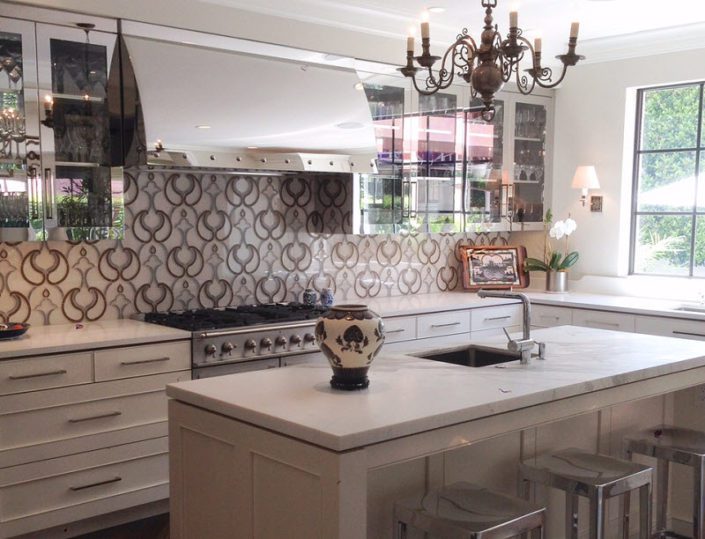
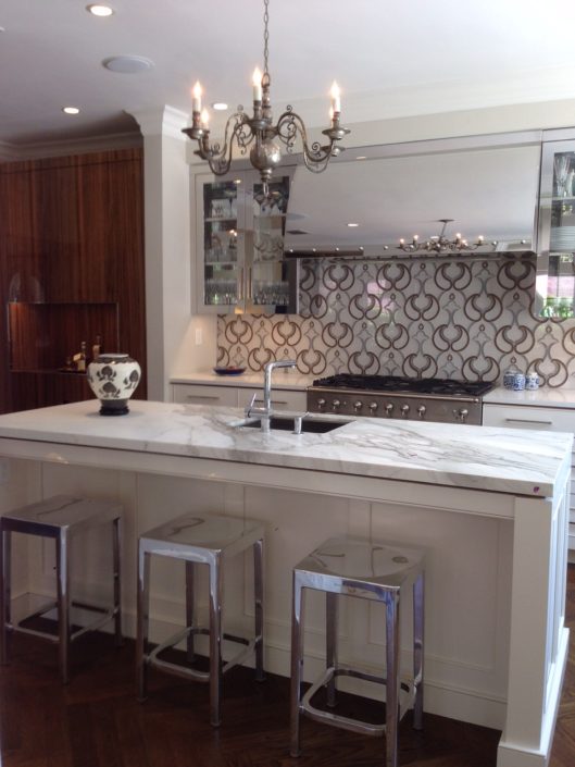
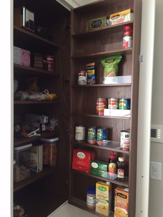
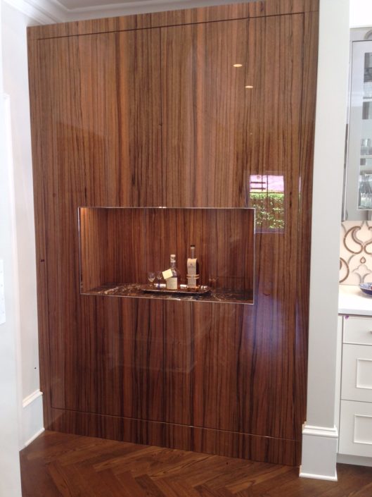
On the modern side, we designed upper cabinets in a mirror finished stainless steel (inside and out) – a first for our cabinet maker, Premier Custom-Built. These will be paired with a custom hood we designed, which is being built by our friends at A.K. Metal Fabricators in Alexandria, Virginia. As a nod to the Art Deco accents of the house, the Bar will be built with high-gloss Paldao wood (from The Philippines) and accented with polished nickel trim. To provide design balance, a classic off-white painted cabinet, with Walnut interiors, will be used for the lower cabinets throughout the space. These are being built by our long-term partner Signature Custom Cabinetry.
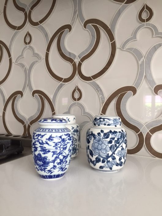
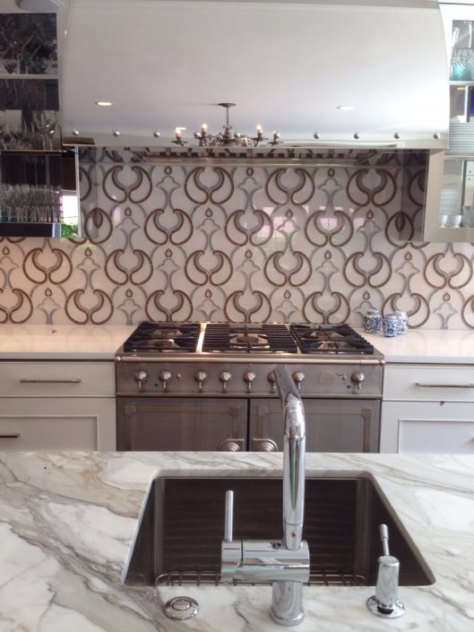
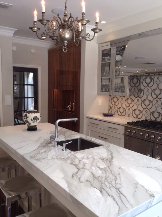
The backsplash tile we selected includes light blue, brown and white marble and glass in a pattern created using a water-jet cut. The tile design is playful, art nouveau inspired and will work well against the white Caesarstone tops at the perimeter and the classic Calcutta Gold marble top at the Island. The backsplash tile is provided by Marble Systems.
Shopping is part of the process too! For the seating at the Island, we found polished aluminum stools designed by Philippe Stark at Design Within Reach. These will play nicely with the mirror finished wall cabinets and hood. For another touch of something old, an antique nickel chandelier from Belgium (1930s) will hang over the Island (pic to come!).
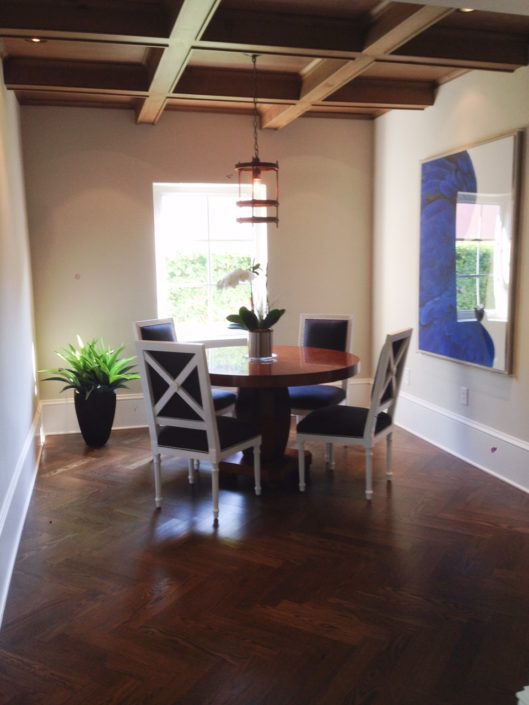
The new Breakfast Room will include a custom Paul Laszlo reproduction table in Yew Wood from J. Tribble Antiques, paired with four Louis side chairs from Jonathan Alder. More to come on this and other materials!
The Final Reveal!
At last, our renovation is complete. The bulk of the work was completed within the 90 days we planned. Our contractor, Cutting Edge Innovative was on time and on budget. We had full use of the space at the conclusion of the 90 day schedule. The final item was the custom backsplash tile, which had to be ordered after the cabinets and counter-tops were installed.
We are thrilled with the results! Our primary objectives were to modernize the floor plan (making it more open by capturing unused space), and upgrading the finishes across the board. Making the space embrace the outdoors was very important as well. The scope included the Kitchen and Breakfast Room, with some upgrades to the Dining Room and Family Room as well. While the new floor plan speaks to the lifestyle of today, our material selections include classic elements, blended with some modern touches. Overall, the space feels fresh and clean, while completely relevant to the history of the home.
After reworking the floor plan, material selection was the key.
On the classic side, we selected: White Oak floors (in a quarter sawn cut and herringbone pattern); Calacatta Gold marble for the Island top; A French range from La Cornue; An antique Belgian chandelier from the 1930s; High gloss exotic wood (Paldao) with nickel trim and San Laurent marble at the bar; and a breakfast table designed by 1930s architect/interior designer Paul Laszlo. The bar and breakfast table were nods to the Art Deco era that was prevalent at the time our home was built.
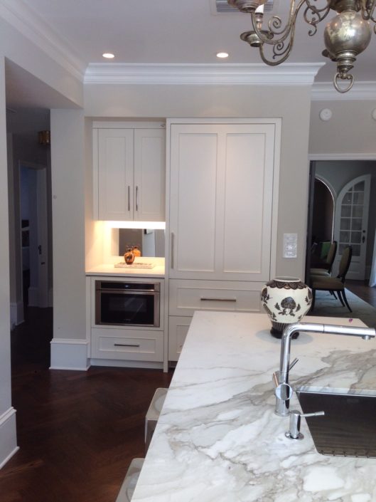
On the more modern side we incorporated: A mirror finish stainless steel custom exhaust hood and wall cabinets; Caesarstone counter-tops on the Kitchen perimeter; Built-in appliances, including a microwave drawer and two dishwashers; An electric solar shade at the new Kitchen window; and high gloss white chairs for the Breakfast Room.
To complete the composition, we chose off-white custom cabinetry (with walnut interiors) and a large scale water jet-cut glass & marble back-splash tile for the Kitchen.
We hope you enjoy the pictures!
LINKS
LOCATION
8000 Towers Crescent Drive
Suite 150
Tysons, VA 22182
Tel. (703) 847-0601
Fax (703) 556-4416
Showroom
Available by appointment.

